 |  |
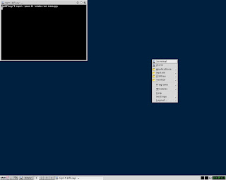
| - icewm - | - fluxbox - |
a few weeks ago I blogged about how interfaces had to look real - and I'd still stand by that but I've been thinking some more about this.
When we talk about interfaces for computer operating systems we really mean the desktop/window manager, and what we're really talking about is a set of expectations, which are to large expect governed by XP.
Everyone has used XP, everyone knows how to find their way around XP via the start menu. Other well known interfaces work the same way, KDE has a start menu, gnome as pull downs as does OS X.
Interestingly, though apocraphally, apparently it's easier to move first year information sciences students across to kubuntu than straight ubuntu, for the simple reason it's more XP like in appearance, and XP is what they overwhelmingly use in school.
So we could say we have two common metaphors, the XP metaphor and the gnome/OS X metaphor. Makes one wonder how quite a different minamalist desktop, eg icewm, would fair in usability testing - given that it breaks the set of expectations, the metaphor, that makes something intuitive.
Same goes for browsers. Same goes for word processors. People could move to Open office easier than Word 2007 purely because it was closer to their expectations as to how menus were structured. Even mobile phones are prone to the same problem - most people know how to find their way round a nokia - give them a samsung and they're stumped.
So metphors are like memes, the collection of ideas that people have about how things are going to work and how things are going to be structured. Step away from the metaphor and people perceive it as difficult, need extra training etc, and hence the cost goes up, etc etc.
And this need for metaphor conformance means that everything ends up being the same - great for transition, poor for innovation, and makes radical change difficult, which goes back to my remarks about the linpus interface - they could have used the native xfce and probably got away with it. They could have customised it to make it look like XP, They didn't, they made something simple and self evident. What they didn't do was use a lightweight manager such as fluxbox or icewm.
Obviously I'm not privy to why, but I'm guessing metaphors had something to do with it ...
No comments:
Post a Comment